I joined the Home Office 4 months ago, after completing an intensive course in user experience design at General Assembly. The course was a mix of theory, workshops and projects, all designed to mirror industry practice.
At General Assembly (GA), I’d heard about the great design work being done around government and I wanted to work on products that helped the public. So when the Home Office interaction design internship came up I applied without hesitation.
Design process
I thought it would be useful to share my experience of the Home Office so far and to compare it to my time as a design student. The main thing I’ve learnt is that designers at the Home Office are problem solvers first and foremost, which is not always the case elsewhere.
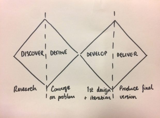
GA teaches a user centred version of the Double Diamond model - a creative process developed by the Design Council. It contains 4 phases:
- discover: explore the problem space
- define: converge on a well-defined problem
- develop: create, test and iterate solutions
- deliver: finalise and launch a solution

These phases all exist at the Home Office, but are much more flexible to adapt to changing constraints. For example, on the Mapping Research Participants project – which aims to make sure government user research is inclusive – the initial prototype had several features designed to meet different user needs.
However, due to changing time and resource constraints, the team decided to focus on meeting the core user need first: allowing user researchers to record and view a spread of their research participants on the Digital Inclusion Scale. This meant we could continue to test and prioritise new features without slowing down the development of the minimum viable product.
Agile work
I’ve noticed that on some projects, Discovery might be shortened (but never dropped) or development might begin during the Define phase, with early insights informing technology choice. Iteration continues well beyond delivery.
Each product team refines the design process to meet its own needs. The first time I attended a retrospective ('retro') meeting – in which a team discusses the previous 2 weeks of work – I was surprised at how open and pragmatic it was.
In these meetings people have raised everything from big workflow issues, to not enough social events, or not enough Post-Its. There is a genuine effort to remove barriers – no matter how big or small – and find ways to improve.
In contrast to my student work, project teams at the Home Office are multidisciplinary. Interaction designers work closely with user researchers, content designers, developers, business analysts, product managers, delivery managers and other professions, depending on the needs of the project.
Designs are scrutinised from multiple viewpoints, uncovering problems that an isolated designer might miss. Working here has confirmed to me the importance of thinking beyond design and incorporating thoughts given in feedback.
Design for everyone
Government digital products have a diverse user base. Public services need to be accessible to everyone and this can lead to very interesting design challenges, where we prioritise user needs, inclusion and accessibility to make better products.
I’ve never been asked to make something 'look better'. Instead, we question every design element from a practical perspective and improve it through user research. Can users understand a page quickly? Does the flow match their expectations? Do colours meet AA accessibility standards for the visually impaired? It’s one of the main reasons I enjoy working here: designers are problem solvers before they are stylists.
Learning in different ways
While there are differences between designing at GA and in government, one thing they share is a strong design community. Whether you need a quick second opinion or a deep critique, it’s always available and knowledge is shared openly.
I’ve also been lucky enough to attend Home Office and cross-government meet-ups, in which interaction designers come together to share and learn. It’s inspiring to hear about the work of colleagues and external speakers. Since I joined, these have included psychology professors, security experts, language analysts and start-up founders, all bringing new tools and perspectives to our work.
While my studies provided a good foundation in user centred design, I definitely feel I have built on it over the past 4 months. There is a lot more to learn, but so far the Home Office has been a great place to kick off my design career and solve problems that matter.
