If I asked you how you make a cup of tea, I'm sure you could tell me pretty quickly.
If I asked you how you'd ideally like to make a cup of tea, with the freedom to change the process in any way, it might take you a little longer.
It's easy enough to get users to describe how they do something currently, but it's harder to get them to imagine what they'd like in an ideal world. That's why service designer Sebastian and I decided to use some neat little tools to help the conversation along.
We wanted to discover the needs and priorities of different people involved in resettling Syrian refugees. What would their ideal digital system look like? What do they need help with? What do they want to consider when placing a refugee in the UK?
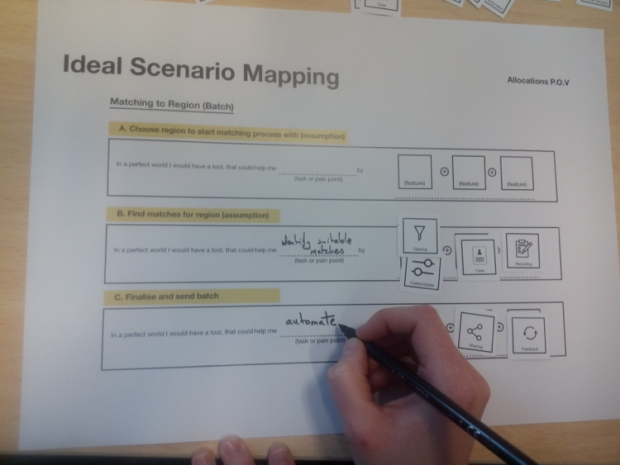
We used two sorts of tools. Firstly, an ideal scenario map that looked like this:

This asked users to consider particular tasks they perform and suggest how an ideal digital tool could help them during these tasks. We included suggestion cards with possible functions such as ‘sharing’, ‘filtering’ and ‘feedback’.
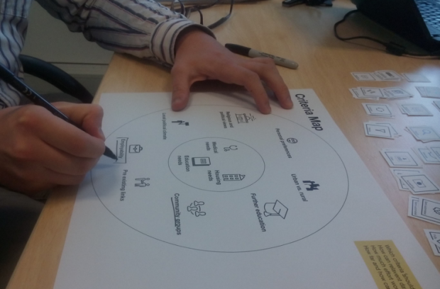
Secondly, we used a map showing the criteria which could be used when matching refugee families to their new homes in the UK:

Matching refugees to a new area is a complex decision and could potentially involve dozens of different criteria. We need to consider housing and health requirements – but what about access to further education to complete qualifications, or trying to send people where their professional skills are most in demand? Laying out these criteria in one place allowed our users to discuss what they would like to prioritise in an ideal world – while not losing sight of the overall picture.
I learned a few things from using these tools:
1. Keep it simple
We had too many suggestion cards. Initially we had around 20 different types of cards for our participants to choose from. Not only did this take a while to lay out in the middle of an interview, but more engaged participants wanted to take time to read through all the cards. Less engaged participants ignored most of them.In future, I'll aim to keep it down to around five suggestion cards and have plenty of blank cards to write down users' thoughts in their own words.
2. Users gonna use – and not how you expected
This means it's vital to take good notes during the process – don't just assume that a photo of the finished exercise is going to tell you all the most useful information. With our exercises, two participants might have used the same card, but rarely meant to say exactly the same thing with it.
3. Some people just won't like it and that's OK
Some people's faces lit up when we brought out the cards – they were really ‘up’ for the process. Others looked like we'd sprung a test on them. Those who weren't so keen sometimes warmed up when we reassured them that they couldn't do anything ‘wrong’. But for some it was too much of a leap.
One participant managed to avoid touching or interacting with the cards for the whole session. However, this still gave us the chance to use the concepts on the table to structure our discussion. As always with user research, it's about being open to what the user wants to tell you and how.
Overall, I'd advise user researchers to give future-mapping tools a go – especially if your research aims to improve a complex process, such as the resettlement of refugees. But don't be too upset if it doesn't go to plan – you've still got a great visual starting point to your conversation.

Leave a comment