There was a recent exhibition at the Wellcome Collection that asked that very question – can graphic design save your life? It made me think about how much graphic design is part of our lives – often without us realising.
Graphic design is often thought of as ‘making things look pretty’. This has been said to me many times during my career. I now realise that what they mean is something that’s designed to be eye catching, effective and easily understood.
But there’s a lot more to it than that. A graphic designer also needs to make tough decisions. For example, questioning content and messaging, understanding user needs and knowing how to use design techniques effectively to support the thing being created. All this while being mindful about accessibility, managing expectations and keeping the client happy.
I use a lot of these skills at the Home Office, where graphics, presentation and content are equally important when designing materials.
Working at the Home Office
I recently started as a graphic designer in the Home Office Digital, Data and Technology (DDaT) team. My role is to produce simple, clear and accessible graphics that everyone can understand, in print or online.
I’ve worked with several teams on a variety of projects, including:
- designing leaflets to encourage people to renew their passports online
- mapping a complex service into a simple visual diagram
- simplifying a timeline feature that’s used across services on GOV.UK
- apply for visas, which I’ll talk a bit more about in this blog
These projects have helped and supported Home Office staff and the public.
Design, test, iterate
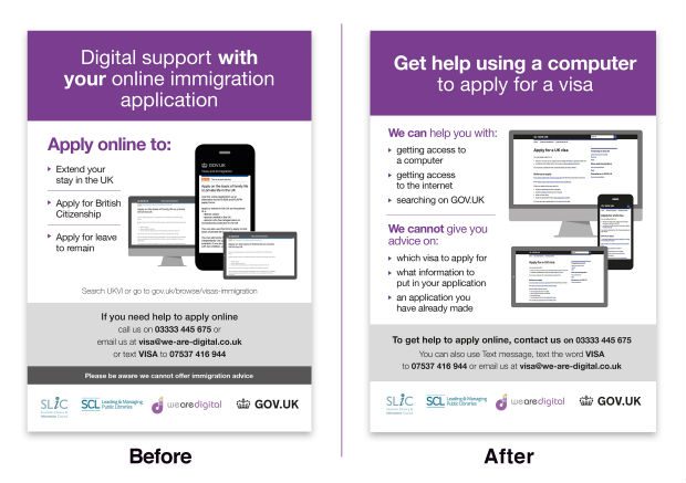
One of my first projects was working with the assisted digital team on a poster for UK Visas and Immigration (UKVI). The assisted digital team works to make sure that people who have low digital skills can still use online government services.
We wanted to tell users what support they can get when applying for a visa online.
The poster was designed quickly and tested in 40 libraries. This research told us that, although it was helpful, people misunderstood the message. Many thought we were offering advice on visas and immigration, rather than help with getting online to complete the form.
We iterated the content and design to make the poster clearer about what we were – and were not – offering. This just shows that it’s not only how things work visually, but also about the need for good content and layout too.
So far there’s been a positive response and we’ll continue to make improvements as needed. The plan is to roll it out to 400 libraries across the UK.
Although this piece of design hasn’t ‘saved lives’, it has supported and helped people in an important aspect of their lives and hopefully made a stressful situation easier to manage.
Making a difference
It’s been a really interesting start and I’m enjoying the fact that my work has already made a difference. As you can see, graphic design isn’t just about making things look pretty – it’s central in so many ways.
If you work in Home Office DDaT and need graphic design advice or support, get in touch at sue.spevack@digital.homeoffice.gov.uk.


Leave a comment