When you’re designing a digital service, it can be easy to lose sight of the problem you’re trying to solve. This is especially true when your team is up against a deadline or has been testing a particular feature or aspect of the design.
Our team, which is building a caseworking system, nearly did this - until we consciously stopped and reassessed what we were trying to achieve, both for users and the organisation.
Stop. Pause. Reflect
As an interaction designer and content designer, we’re constantly exploring the relationship between information and interactions. This means we often discuss, sketch, wireframe and prototype ideas together.
We also welcome feedback and trust each other’s opinions, which means we’re able to challenge each other’s ideas and raise concerns if we have them.
In this case, we both had questions about a range of complex features that were being developed following suggestions from users. While many were useful, we were not sure they were essential for our minimum viable product (MVP).
To work this out, we agreed to pause and dedicate a day to reviewing the end-to-end service. This was risky as we were 6 months into a build and already mid-pilot, but we thought not stopping would be riskier. If we continued to focus on new features, we’d end up with a design that worked for our pilot team but potentially no one else.
We could not afford to do this, as one of our aims was to create a design that could be easily adapted for a range of teams and processes.
Seeing the big picture
The following morning, we started by reviewing:
- the problem we were trying to solve
- who our users were
- what our service needed to do for them
Looking at the bigger picture allowed us to see things we could not when we were focused on the details.
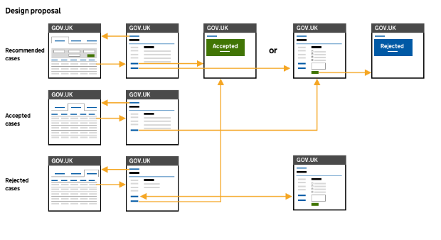
We then spent the afternoon discussing and sketching ideas. We did not want to be influenced by our existing design, so we started with a blank sheet of paper. By the end, we’d drafted a simpler, clearer, more adaptable design.
Getting our team on board
We knew it was important to keep our team informed, so we shared our concerns and explained why we wanted to review the current design. We also asked how they felt and invited feedback on the ideas we’d sketched out.
Following this, we wireframed our design and presented it to our product owner and service manager. We explained the restrictions of the existing design before outlining the benefits of making the service more scalable, adaptable and reusable.
They had concerns about the impact such a change might have on budget, delivery and business change, so asked us to prototype our design while they reviewed our proposal. We acknowledged that making changes at this point would be disruptive, but outlined how it would save time and money in the longer term.
We completed the prototype in a day as proof of its simplicity. Later that week, our team was told to halt the current build and end the pilot so that our developers could start working on the new design.
Testing our design
We’re about to start a second pilot with our new design, which has received a lot of positive feedback from users during testing. No one has said they miss any of the features we removed.
The design has also been adapted for 4 different teams. This has been relatively quick and easy to do, yet would have been expensive and time consuming with our old design.
We’re still learning from our users and will continue to iterate our design. In the meantime, this experience has taught us how important it is for service teams to keep thinking about the outcome they’re trying to achieve, pause if they need to and speak up if they realise anything is missing, needs realigning or should be stopped.


1 comment
Comment by Fola Ekundayo posted on
Thanks for sharing this.
It's really encouraging to see examples of the UX team having the courage to challenge decisions and being successful.
I think the fact that you were pragmatic and quickly demonstrated what you were proposing must have helped. Well done!