
When designing a service, you might hear people say things like, “We’ll just add some more content to explain it,” or “We can just fix that by adding content.”
While these comments are generally well meaning, they miss a crucial point about how people read online. People don’t read the web like they do a book – they scan and skip around web pages. Usually because they’re trying to complete a task and looking for content to help them.
Adding more content to a page means adding more information, which makes the page more complicated. Helping users complete tasks means removing complexity, not adding it.
Fix the problem
Often, more content is added as a solution when user research has uncovered a problem with a service. But it can also be when there’s a technical or legal reason that means a service must function in a certain way.
In both situations, it’s looking for a quick fix rather than addressing the underlying usability problem. It’s also misunderstanding how content design can help build good services.
Content design works best as part of a cross-functional agile team. Working with interaction designers, user researchers, developers and policy makers gives content designers a good understanding of the entire service. This helps the team solve problems holistically, with content, design and development working together to create a simple, consistent experience.
Minimal viable content
That’s why content designers in the Home Office aim to write minimal viable content – what’s the least amount of content a user needs to complete a task?
Minimal viable content makes you focus on giving the right information at the right time. It can also help to identify potential usability issues, for example if you:
- have to use lots of conditional clauses (like ‘if’) or indeterminate language (like ‘might’ and ‘could’)
- have to explain an interaction for it to make sense
- can’t describe a call to action simply
These are all warning signs that a user might struggle to know what to do. A lot of content design isn’t about adding words, it’s about working as a team to remove the need for them, sometimes by iterating the design.
A good example of this is the Prove your right to work to an employer service. One of the early designs asked job applicants to use the service to create a unique code to give to an employer to prove they’re allowed to work in the UK.
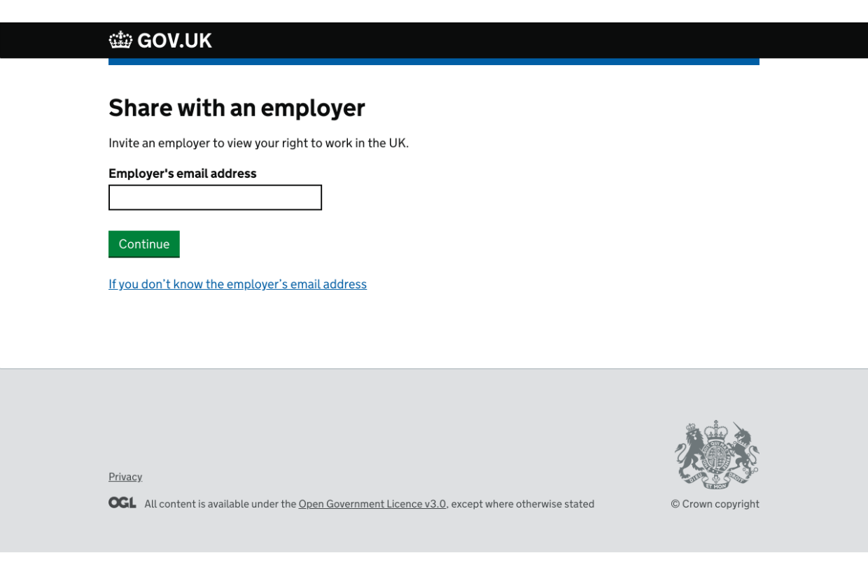
However, during usability testing we found that some users were not sure what to do with the code.
Instead of adding more explanatory content, I worked with the user researcher and interaction designer to simplify the service by changing the flow.
Now job applicants don’t need to see the code. Instead, they enter an employer’s email address and the code is sent directly to the employer with instructions on how to use it.
So if you hear someone say, “We’ll add more content to fix that", try asking them, “How can we design the service so it needs less content?”
1 comment
Comment by Jennifer Murphy posted on
I totally agree; please keep posting examples showing how design and content can work together to improve Services.