As a Content Designer for the Home Office I work on online services that help users complete a task, like applying for a visa or submitting documents. I write content in short chunks, split up across multiple pages: a few lines of text in the main section/s, a label for a button or an error message.
In December 2021, I was offered the opportunity to work on a longer piece of content in collaboration with a Content Designer from the Government Digital Service (GDS).
That year, more than 15,000 people were evacuated to the United Kingdom (‘the UK’) from Afghanistan. People in the UK were eager to help them settle in by donating time, expertise or goods, or by offering accommodation or employment, but they didn’t know how. Many asked their local authorities who were unable to direct them.
GDS was tasked with setting up a single source of information so people who wanted to offer help could find the right organisation to contact. The Home Office was involved in the project as we were already working on the resettlement and relocation programme.
The challenge of designing at speed
My fellow Content Designer and I needed to work quickly, as people arriving from Afghanistan urgently needed jobs and homes.
Our first step was to decide on a format for publishing the information.
We could have provided a list of links to other organisations’ websites, but there’s a risk that links will change, or that third-party websites won’t be accessible.
We considered a form that users could fill in, but that required a developer to build it and we wanted a quicker solution. We also considered a ‘smart answer’ which guides the user to the right place based on how they answer questions, but these can be tricky to set up and edit.
The right format for the job was a guidance document: a set of linked web pages with a table of contents for navigation. Guidance documents rank high in searches, making them easy to find. They are scalable - it’s easy to add or remove information - and can be updated quickly.
Different government departments and charities worked together on the content, including Home Office, Cabinet Office and the Department for Work and Pensions.
Some were happy to leave all the content to us. Others wanted to be involved with writing it, while not necessarily understanding the user-centred design principles we work to.
Our task was to create a clear and consistent guide from all this information.
How we collaborated across government to design content
I collaborated with a Content Designer at GDS to produce the guidance. We worked on an online document, making changes and leaving each other comments, with occasional video calls to work on an issue together.
With limited time for user research, we asked our stakeholders about the sort of enquiries they'd previously received and any common problems we might be able to solve by providing the right information upfront.
We wanted to tell people what wasn’t in the guidance as well. We specified that there wasn’t currently a route for donating goods such as clothes and furniture, to stop people searching for information that wasn’t there.
I asked Home Office colleagues for help finding the right terminology. For instance, we needed to specify the group of people we were supporting as ‘resettlers’, rather than refugees or immigrants, and emphasise that they’d entered the country by legal routes.
As well as content design we chose a short address for the page (www.gov.uk/help-afghanistan) and set up a Home Office email address to forward enquiries to external organisations.
We sent our work to stakeholders so they could check the facts and peer review. The finished version went back to stakeholders for a final check before it was published.

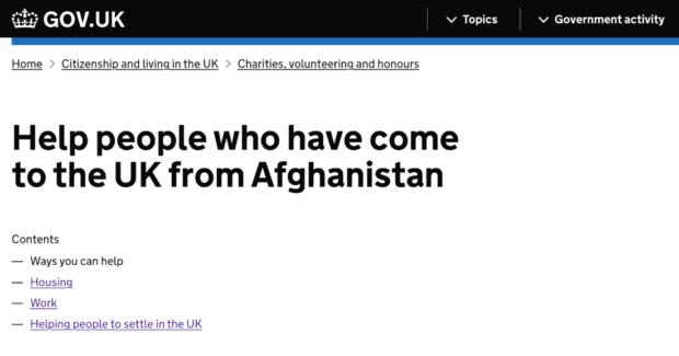
A screenshot of the final guidance on GOV.UK available at gov.uk/helpafghanistan
Iterating based on analytics data and user research
User-centred design teams change frequently, so it’s unusual to see a project through from start to launch. But in February 2022 I was able to see our work published online.
It’s unlikely our content will stay the same for long. Now the page is live, other designers will use analytical data and user research to improve it, keeping the information up to date and adding new ways to help people arriving from Afghanistan.
Our work has also informed decisions on the best way to organise content to help people coming to the UK from Ukraine.
Want to make an impact?
User-centred design at the Home Office is about designing our products and services in collaboration with the people who will use them.
We work on some of the most challenging and important government services. Our work helps to keep people safe and the country secure.
You can find out more about user-centred design roles at our Home Office Careers website.

1 comment
Comment by Candy Chiu posted on
Dear Alice
Thanks for your sharing. I am always impressed by the user-friendly design on pages in Gov.uk. It is quite different from other governments' websites where resources are embedded somewhere. Thank you so much for making the citizens/ new comers' lives easier. Thank you.