A principle of design I follow is: good design should be invisible.
Invisible design doesn’t mean that it doesn’t exist; it means the product is so well designed, users don’t notice the design when they use it.
Following on from our blog post about patterns, I want to go into more detail on our icon pattern.
What are icons?
Icons are a visual representation of an object, action or idea.
They can benefit users by signposting recognised actions, wayfinding through content or being a bigger target for users to interact with.
Why we made the icon pattern
We spent time researching how icons were being used in the Home Office and across government, meeting teams and looking at their research to understand what needs icons were meeting, particularly for internal services.
Our research was primarily qualitative. We found a lot of inconsistency in what and how icons were used, which caused issues with both perception and expectation. This was making services harder to use and increasing cognitive load, as seen elsewhere in government services.
‘I need to know more about what the icons mean - is there a legend?’
However, we also found a significant number of instances where icons helped users find and process tasks faster and easier, for instance signing out, navigating and interrogating data.
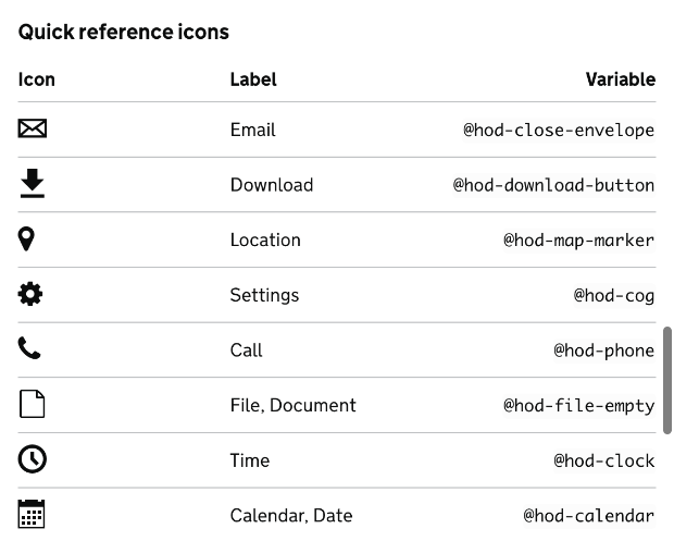
Types of icons
We have recommended a limited number of icons for internal services and grouped them into categories that have significant benefits for users.
The 3 types of icons are navigation icons, designed to help users through a service, controller icons, designed to help users sort, organise and adjust information, and quick reference icons, designed to help users identify frequently used objects or links.
Using icons
We recommend using icons when there is a clear user need and to conduct many types of tests during the life of the product, both in and out of context of the product. We will continue to research in and out of context to ensure that when icons are used, they are understood and meet user needs.
Remember, design should be invisible. If it isn’t, maybe it shouldn’t be there.