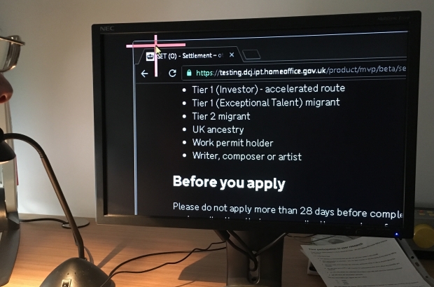
Chris has worked in UK Visas & Immigration (UKVI) since 2003. Aspasia, a user researcher working on visa applications, invited Chris to observe a research session. Together they went to visit John, who has a degenerative eye condition that’s left him with only 5% sight in each eye.
Chris has seen many visa application forms in his time – some of them more than 70 pages long – but this was the first time he’d observed a visually-impaired user interact with a digital service and he was astonished.
Here is Chris’ account of the session.
Testing the service with a screen reader and voice recognition user
When I first encountered the new service, I was struck by how much simpler and more intuitive it was compared with what had gone before. There were still odd niggles and quirks, but I felt it was user-friendly and would make life easier for those applying.
I observed John using an impressive variety of assistive software to cope with his condition; a screen reader, a magnifier and voice recognition meant that he can use his computer independently. Knowing the hard work the team had put into the development of the new application form, I was confident we were about to see it work well for him.

The user research proved my assumption to be wrong
John started off using voice commands to activate his screen reader. This was the first time I’d experienced such software in action, and initially it all seemed very impressive.
John remarked that the text seemed nice and linear, and my hopes were high. However, once John had read the whole page and started trying to navigate it, he quickly found himself in difficulty.
When large sections of text were read out, the words washed over him and he needed to start again. John uses keyboard commands to move the cursor around the page, but when trying to move the cursor up the page, it got stuck in the page footer.
This difficulty in moving between sections occurred several times and was a real source of frustration for him.
John also had difficulties entering information into editable fields. Sometimes he thought he’d finished a section and hit the enter key, only for this to be taken as a command to proceed – at which point an error message appeared, as not everything had been completed.
After two hours of testing, we hadn’t even got as far as entering an email address and password. John tried to get to the email address field, but the focus jumped to the password field below. Moreover, the password rules were too complex. To quote John, ‘at this point, I’m about to head-butt the screen in frustration!’
Just because I can use the service, doesn’t mean others can
Remember those niggles I mentioned earlier? Well they’re niggles to me, as someone who’s a pretty confident IT user with lots of experience using visa forms, but for someone less familiar with our systems, whose first language isn’t English and who has access needs, these niggles become real barriers.
When you factor in the stress users feel (as applying to remain in the UK has a massive impact on their lives), what seems to be a user-friendly system quickly becomes a different proposition!
Get it right now, save time and cost in the long run
In our research, we found issues sooner because we tested the form with people who have access needs. This is often the case, because these users are more sensitive to usability issues and can uncover them sooner.
The team is now improving the content, design and code of the forms to address the issues John encountered. By making the service more accessible for John, we’ll make it easier for everyone to use.
At the Home Office, we’re inspiring a culture shift towards putting users first by seeing them using our services in action. If user research is a team sport, then the players should come from teams across the department – not just the digital teams.
Observing user research makes us think about services from the users’ perspectives. It colours our thinking, so next time we develop a service we use those learnings to make it more accessible from the outset.

Leave a comment