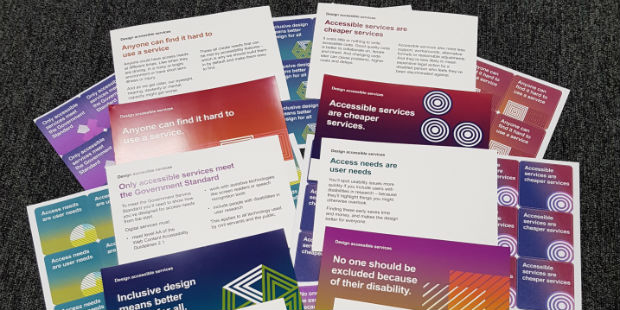
A while ago, Home Office graphic designer Sue Spevack and I made a series of posters called Design Accessible Services to remind delivery teams why accessibility must be built into everything we make.
Based on feedback and queries, we iterated some of the statements in the posters. We also created sticker versions and postcards with more details to further highlight the importance of designing for all users.
The launch of these is a great opportunity to talk again about our motivation for the statements, what they mean and why they matter.

Inclusive design means better design for all
This statement conveys that making your service accessible doesn’t just help people with access needs - it means everyone can use it more easily.
For example, video captions are essential for people who are D/deaf or have hearing loss. But they also aid comprehension and are useful for anyone who wants to watch without sound.
Inclusive design also helps people in situations like having only one hand free, being stressed or reading without their glasses.
Access needs are user needs
You’ll spot usability issues more quickly if you include users with disabilities in research – because they’ll highlight things that are pronounced to them but others overlook.
Finding these early saves time and money, and makes the design better for everyone.
No one should be excluded because of their disability
As well as being the ‘right thing to do’, it’s a legal requirement to treat people with disabilities equally, in terms of opportunity, experience and outcome.
The Equality Act 2010 says civil servants and government departments must work to eliminate disadvantage as part of the Public Sector Equality Duty.
This applies to all parts of services: communications, training materials, policies, locations and human interactions, as well as on-screen interfaces.
The best way to do this is to make things accessible by default and add reasonable adjustments where needed.
Only accessible services meet the Government Standard
To meet the Government Service Standard you’ll need to show how you’ve designed for access needs from the start.
To pass a service assessment, digital services must:
- meet level AA of the Web Content Accessibility Guidelines 2.1
- work with assistive technologies like screen readers or speech recognition tools
- include people with disabilities in user research.
This applies to all technology used by civil servants and the public.
Anyone can find it hard to use a service
Anyone could have access needs at different times. Like when they are driving, in a noisy or bright environment or have a short-term illness or injury.
And as we get older, our eyesight, hearing, dexterity or mental capacity might get worse.
These all create needs that can be met by accessibility features – which is why we should build them in by default and make them easy to find.
Accessible services are cheaper services
It costs little or nothing to write accessible code. Good quality code is better to collaborate on, iterate and inherit. And changing code later can cause problems, higher costs and delays.
Accessible services also need less support, workarounds, alternative formats or reasonable adjustments. And they’re less likely to mean expensive legal action by a disabled person who feels they’ve been discriminated against.
Download the latest version of the Design Accessible Services posters and postcards including these explanations so you can print, put up or distribute them yourself. Find us at events to get some stickers.

Leave a comment