At the Home Office we have a strategic ambition to make better use of data. We know that good quality data will improve outcomes for the people we serve, while also ensuring the Home Office can be efficiently run. To this end, we have several sophisticated internal data products which are run by teams of talented data experts.
But like a lot of large organisations, that is only one of many objectives that needs to be balanced with our other ambitions. We are also trying to be more user-centred in our approach to the design and delivery of our products and services.
Applying new ways of working to established data products and the teams delivering them is not straightforward, so we want to share what we have learned as a user-centred design team, working alongside other technical professions, to build a complex data-driven product.
Working on a data product - who we are, our team and our product

We work in a multidisciplinary team of technical and user-centred colleagues, including Data Scientists, Developers, User Researchers and Interaction Designers.
We’re currently building and developing a research tool which will enable internal Home Office staff to search across, and identify, data which relates to suspicious patterns of behaviour.
However, working on an ever-changing, complex data product means balancing data dependencies and development timelines, while ensuring users’ needs are at the centre of any decisions we make.

Qualitative research and collaboration are important at discovery
We recently conducted a discovery on data quality, and how users interpret it, to show how we achieve this balance between data dependencies, development timelines and user needs.
During discovery we researched what data existed and how users understood it, framed any problems to be solved and gathered evidence in order to guide us in next steps.
The Data Scientists on the team conducted their own exploratory research, analysing data produced by an algorithm, which explored connections between different sets of information. They explored whether the results returned by the algorithm provided valuable insights, without overwhelming the user with unmanageable amounts of less useful data.
Our User Researchers then gathered feedback from a range of users and stakeholders to assess the value of this data, to ensure the algorithm we created was aiding users with beneficial information.
Parallel to this, our Interaction Designers built wireframes and mock ups which we used to run workshops to confirm assumptions, as well as for live design sessions, and conversations across professions. We involved the stakeholders and users in this process to ensure we continued to meet their needs for using and interacting with this data.

Testing realistic data helps, when you can get it – alpha
At this point we produced designs we wanted to test but, as they were prototypes, they were not connected to live data. We had to create mock scenarios and mock data so that, during research, users could navigate and interact with a realistic journey. While mock data is a useful tool, it only gives a snapshot of what the final data may look like. The final live data is likely to have its own unique situations that mock data doesn’t account for, as well as variations across data sets, and so this must be considered during research.
To help ensure that the mock data was as close to the final data as possible, we again worked closely with data science to produce real data that we anonymised and fed into our prototypes. This can be a lengthy (but crucial) process to enable us to present information to users that is as accurate and realistic as possible.
We worked with our stakeholders to critique the data and prototypes to ensure they were as expected, before conducting usability testing with the users to assess whether the interface enabled the data to be efficiently explored.
To fully test the design, we then developed it in the live system, connecting it to the data to simulate a more realistic experience for users in the beta phase of testing.
Establishing clear handover processes in beta
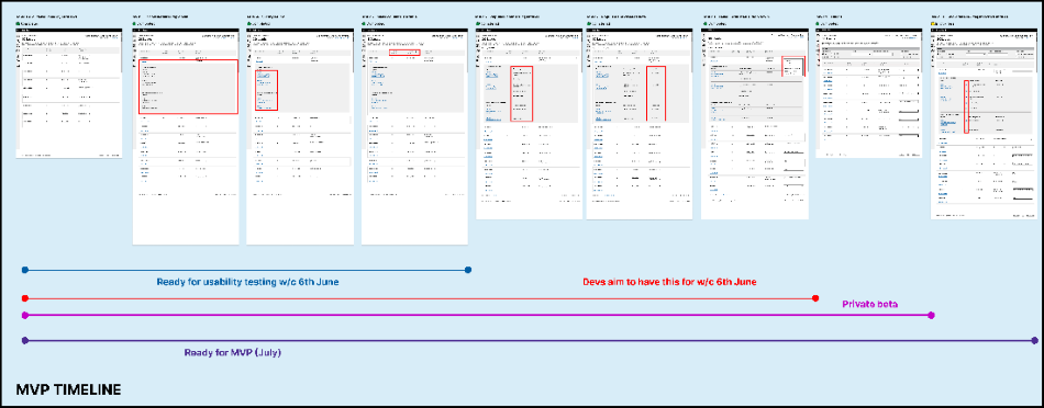
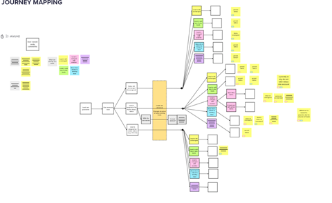
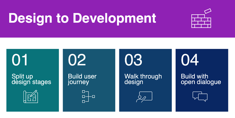
Once the research findings showed that our design was meeting user needs, our team developed a clear, documented handover process between roles to ensure a smooth transition from design to production:
- Split design into key development steps, breaking up the overall interactions into smaller tasks.
- Build a user journey diagram, clearly dictating each part of the user’s interactions.
- Walk through the user journey with the rest of the team, in particular data scientists and developers, ensuring the user journey is understood and that professions can collaborate on tasks where possible.
- Work closely with the developers as they build screens, keeping an open conversation for questions as each part is built, maintaining an agile process as we develop.

Run pilots to support the transition from design to build - beta
Once the product was built and had been through multiple rounds of usability testing, we conducted a pilot study at the end of beta.
The pilot involved getting users to actually use the system, alongside other live systems, to conduct their day-to-day work practices and assess its success. This is a useful approach when working with internal data products as it helps us realistically evaluate whether the system works effectively in the context of the other tools and systems users are working with.
Working collaboratively to continuously improve the product – live
The product was then officially made live. But even after this point we continued to improve the data itself, as well as the design, to provide even more value to users and aid their investigations. We continued to research with users, testing out new features and enhancements to the product.
It was key at this stage to involve the whole team in the process, so that we could use the research findings to help identify design or data issues that were needed to be addressed along the way.
By working closely together as a multidisciplinary team, we could ensure the product and the data within it was presented in a way that met our users’ aims and considered their needs throughout the entire process.
Want to make an impact?
User-centred design at the Home Office is about designing our products and services in collaboration with the people who will use them.
The work we do to design government services is varied, exciting and challenging.
You can find out more about user-centred design roles at our Home Office Careers website.

Leave a comment