
When we’re designing a service, there’s lots we need to understand and we have lots of questions. We don’t always find answers to these questions quickly.
We often face short deadlines and need to deliver services despite not knowing all the answers. In such cases, how can we still deliver something that users will be able to use?
Making assumptions
As designers, we take time to understand users, processes, policy and operations. We can then hypothesise about the best approach to design. User researchers put our initial designs to the test to find out what works and what does not.
When deadlines are much shorter, there might be fewer rounds of research and iterations, so our assumptions might carry more risk.
Interactions have different levels of risk
Risks will always exist when we choose one thing over another. Deciding which thing to choose will be determined by different factors – professional experience, usability research, a collective public knowledge, and shared experiences of all these across the government community, or through existing design patterns.
Confidence can rise and fall in the course of a user journey, depending on what we know at that time.
That's why we’ve started to use an indicator to communicate the ‘relative confidence’ we have in a particular part of a user journey at a particular time.
This helps the team, and the wider organisation, understand and prioritise what needs more work.
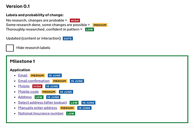
How we measure risk
Our confidence relates to the level of risk. These tags are high (colour coded red), medium (yellow) and low (green). They’re based on 3 things:
- The range of participants we’ve researched with.
- The design pattern’s prevalence – who else uses it?
- Our understanding of the question, why we're asking it and how we use it.
These tags quickly illustrate how confident we are with an interaction – what parts of the service should not change, could change or definitely will change.
They also remind us what we need to revisit and prioritise what we work on next.
Grouping the designs and iterations into milestones also helps snapshot what was delivered, how it’s intended to look and what will be included next.
This system is an art rather than a science and I’d love to hear ways other teams are documenting design.
4 comments
Comment by Víctor posted on
This is more like project manager work. In my case I do something similar with my PjMg and we classify by priority level. The priority can be affected by dev time vs final impact we believe it is going to have, the need for the change...
Comment by Eliot Hill posted on
This could certainly be used to feed into a prioritisation matrix along with input from other team members working on the service.
Comment by Martin Jordan posted on
Super useful, Eliot! I’ll share that with others. Thanks ?
Comment by Paul Moran posted on
I’m exploring how we can use service blueprints to connect user journeys with a more operational perspective to help product owners with the ongoing management of the journeys they are responsible for. Showing where we are doing/plan to do research is one of the swim lanes I’ve been considering but hadn’t landed on a way to do that effectively. I think this could work in that context so thanks for sharing.